YOUR BUSINESS AUTHORITY
Springfield, MO
YOUR BUSINESS AUTHORITY
Springfield, MO
This poll is not a scientific sampling. It offers a snapshot of what readers are thinking.


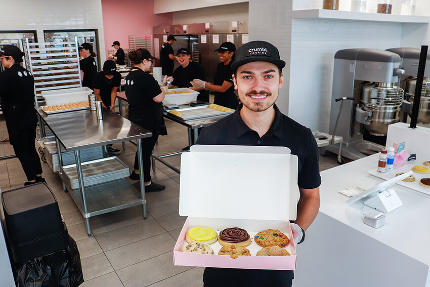
Utah-based gourmet cookie chain Crumbl Cookies opened its first Springfield shop; interior design business Branson Upstaging LLC relocated; and Lauren Ashley Dance Center LLC added a second location.
Updated: Systematic Savings Bank to be acquired in $14M deal
Warby Parker store planned in Springfield
Former CoxHealth colleagues starting communications firm
Former Wentzville superintendent to get $1M in contract buyout
STL construction firm buys KC company
NPR editor resigns after writing piece critical of organization
Survey finds increase in average salary Americans willing to take
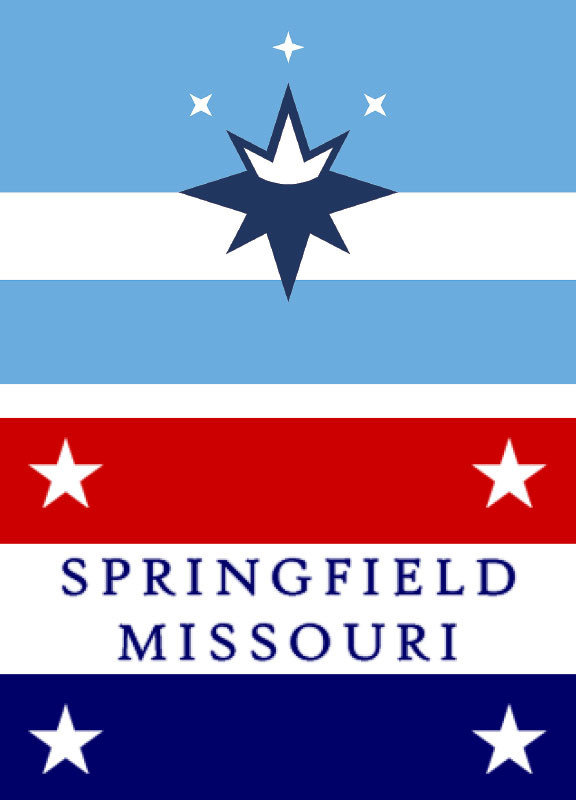
Your choices do not match the layout of the flags. This design flaw in your poll is minor but has huge impacts in how people perceive their answers. This flaw invalidates your results.
I don't have a problem with the new flag design... except that the color scheme is pretty boring. "Powder Blue" does not say "SPRINGFIELD, MISSOURI" to me. If they just kept the color scheme of the ORIGINAL flag with the design pattern of the new flag, it wouldn't be half bad.
I prefer the new flag to the old one, and I doubt I could design a better one. That said, it's still a little...boring. Less boring than the old flag but still somehow lacking the elements of nature that are the one thing that help Springfield stand out. Some green maybe, and maybe a different shade of blue. That blue is so...bland.
I am tired of people tearing down tradition. The “old” flag is our history! Keep it!